design + impact

project snapshot

Visual Design

Crafting sleek visuals, on brand and rooted in purpose and clarity.

frontSignageBarrie MAIN

Web Design

Custom, responsive websites with engaging elements and seamless UX.

cottysupdatedscreenshot MAIN (1)

Photography & Editing

Professional photography and polished edits that elevate messaging on every platform.

modern-subcompact-crossover-suv-beautiful-wheels-large-chrome-grille MAIN

Branding & Logos

Branding and storytelling that connects and inspires an audience.

Dundas Synopsis MAIN

Digital Assets

Bold, original artwork, using the latest tech, including 3D, that adds personality.

Project intensive

Find out about my process
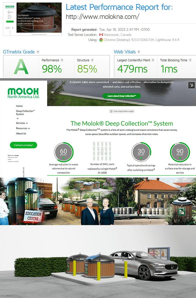
Molok North America

Established in 1999, this company has a long legacy of quality and compassion for the environment.  My tenure with Molok wrapped up with a large, full scale website with all the trimmings.
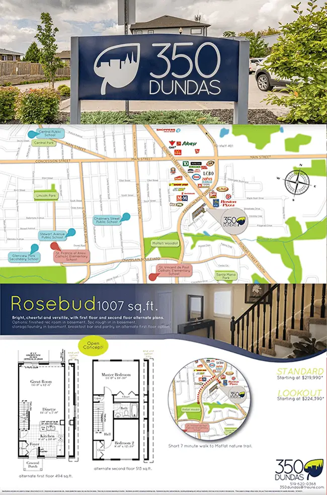
Freure
Homes

A staple in the Kitchener-Waterloo Cambridge community, Freure Homes specializes in residential building – developing large real estate areas into thriving communities. 

Wright
Cleaners

Wright Cleaners is the expert destination for all things textile cleaning in Barrie and area.  Recovering from the last 5 years, Wright Cleaners has strengthened their marketing. 

Cotty's
Cleaners

A staple in the Barrie community since the 1960s, Cotty’s Cleaners has been providing trusted, high-quality garment care for generations. Committed to excellence and customer satisfaction, they combine professional service with eco-friendly solutions to keep your wardrobe looking its best.

Georgian Commercial Laundry

An important contributor to the community, Georgian Commerical Laundry, under the Wright Cleaners umbrella, has been providing textile care for extreme damage by smoke, fire and water damage.

Priyanka Nandi, Realtor

A trusted name in Saskatoon real estate, Priyanka Nandi brings years of experience, a multicultural perspective, and a passion for helping clients find their perfect home. Priyanka provides professional guidance and a personal touch every step of the way.

Wright Cleaners

Now that life is resuming to some semblance of normal, the owner and president of Wright Cleaners decided it was time to refresh some signage at his main plant in Barrie.  Knowing this sign would be highly visible on Bayfield St., it was imperative that the image and message were perfect. John, the president was very open to suggestions of what might look good for his worn out sign (mid left), so I got straight to work examining various options.

With the snapshot of the existing sign, I was able to place several options for John to review and consider (mid right).  He really liked the fancier suit with the measuring tape, but after some consideration, felt that it might’ve been too formal.  Alterations are available for everything at the Bayfield location, and John wanted to make sure that came across visually.

I had located the perfect suit (top), and with a colour change of a gentler blue for the tie, a careful placement of a virtual tape measure, we were in the home stretch.  John was pleased with both the end result and the collaborative effort that was put into the project.

Sample of the Large Scale Signage completed for Wright Cleaners

Cotty's Cleaners Redesign

I was brought in to give their digital presence a fresh start. Beginning with their brand as the foundation, I rebuilt the site from the ground up on the WordPress platform. The goal was to maintain brand recognition while elevating the overall look and functionality to meet modern standards.

My process included:

  • Working within established branding: Honored their existing colors, logo, and identity while refining how they were presented digitally.

  • Recreating the site from scratch: Migrated and redesigned the structure on WordPress, ensuring the platform would be easy to manage moving forward.

  • Imagery curation: Sourced and selected photography that reflected cleanliness, trust, and professionalism: qualities central to Cotty’s services.

  • Modern, approachable design: Crafted a sleek, uncluttered layout that feels fresh and contemporary while staying approachable to their wide customer base.

  • Improved usability: Simplified navigation, ensured mobile responsiveness, and emphasized clear calls to action for better customer engagement.

The result is a polished, modern website that not only communicates the credibility and warmth of Cotty’s Cleaners but also sets them up with a flexible, easy-to-maintain platform for the future. It bridges the gap between tradition and modernity, giving them an online presence as reliable and professional as the service they deliver in-store.

305 Dundas for Freure Homes

Customized branding for the new development for 305 Dundas, a pocket of townhomes built close to amenities and major routes.  This custom branding included colour story and logo.  The accompanying collateral material included custom photography and brochure with digital maps, aerial views and floorplans.

When starting out with a project such as this, I consider the demographic that these townhomes would be sold to.  This customer would possibly be a younger first time home owner, who would find the central location of this development very attractive.

Considering the demographic, I opted for a trendier feeling for the logo and colour story: navy and lime green.  Most housing developments include a reference to nature and housing, thus the leaf and city line in the logo.

The map was entirely developed in Adobe Illustrator, using another map as the base.  We then would have the option of highlighting the nearby shopping and schools.

Molok North America Synopsis

The purpose of this project was to design and develop a visually appealing and user-friendly website for molokna.com. The website serves as an online plaform for Molok North America, a manufacturing company that offers a variety of products and services in the field of semi-underground waste containment.   HubSpot platform.

My Contributions.

Project Management: Develop website from wireframing, to light developer coding to finished product.

Brand Representation: Create a website design that reflects Molok’s brand identity, values, and ethos. The design incorporates Molok’s logo, color scheme, typography, and overall visual style.

Product and Service Showcase: Created dedicated pages to present Molok’s products and services in an organized and visually appealing manner. Incorporate high-resolution product images, 3D representations, and any relevant specifications or features.

Responsive Design: Ensure the website design is responsive and optimized for various devices, including desktops, laptops, tablets, and mobile phones. The design should adapt to different screen sizes and resolutions, providing a seamless user experience across all devices.

Search Engine Optimization (SEO): Implement basic on-page SEO techniques to enhance the website’s visibility in search engine results. Optimize page titles, meta descriptions, headings, and image alt tags. Ensure the website follows SEO best practices for improved organic search rankings.

Performance and Speed: Optimize the website’s performance and loading speed to provide a fast and seamless browsing experience. Minimize file sizes, leverage caching techniques, and optimize server response times to ensure quick page loading.

Sample and results capture of MolokNA website

Georgian Commercial Laundry

Georgian Commercial Laundry is the mainstay for the Wright Cleaners business for all large projects. Mainly being a source of service and comfort when disaster strikes – everything from water damage, smoke and fire, to mold, Georgian Commercial Laundry will take the pain out of the process, restore your cherished belongings and work closely with your insurance provider.

The Georgian Commercial Laundry website, however, over the years, suffered the fate of many when Adobe had discontinued its Flash platform. Barely functioning, John Sekleski, the owner and president, placed the task in my hands to restore his website to its former glory, but better.

Using existing collateral booklet material for content, I had taken on the project with care, providing a logical presentation of the content. Add on some refreshed photography and a video showing how the laundry works, and visitors feel like they have had a personal tour.

Now in its 97th year, Wright Cleaners now has a fresh, new, dynamic site with all the modern trimmings, as a touchpoint for clients and insurance brokers alike. Visit www.georgiancommercial.ca

The Heart of It All

Marketing is about connection: between people, purpose, and ideas. It’s research, timing, design, storytelling, and strategy working in harmony. It’s knowing your audience and knowing what they need before they do.

I’ve worked on everything from brand launches and email campaigns to internal communications and print collateral. Each project guided by a clear goal and creative insight. What ties it all together is thoughtful design and intentional messaging that moves people to act, feel, or think differently.

This is the “more” I bring:
• Marketing plans rooted in real-world data, not assumptions
• Campaigns that blend emotional impact with clear calls to action
• Collaborations that honour the story behind the brand
• Design that amplifies – not just decorates – the message

Marketing, at its best, builds trust. And that’s what I aim for every time.

Priyanka Nandi - Custom Website

Priyanka Nandi wanted a fully customized online presence that would showcase her real estate expertise while making it easy for clients to browse local listings. The goal was to create a modern, professional, and user-friendly website tailored to the Saskatoon market.

I built the site from the ground up, designing a platform that integrates up-to-date MLS listings for the local area and highlights Priyanka’s experience, community involvement, and personal approach to real estate. Key aspects of the project included:

  • Full customization: Developed a website architecture that reflects Priyanka’s brand while offering intuitive navigation and seamless property searches.

  • MLS integration: Embedded dynamic, real-time listings to provide clients with accurate, current information on homes in Saskatoon.

  • Visual storytelling: Curated imagery and design elements that communicate trust, professionalism, and approachability.

  • User experience focus: Ensured the website was mobile-friendly, easy to navigate, and encouraged engagement through clear calls-to-action.

  • Brand alignment: Maintained consistency with Priyanka’s personal brand across all visual and written content.

The result is a polished, modern website that gives Priyanka an online presence as professional and approachable as her real estate services. It serves as a central hub for clients to explore listings, learn about her expertise, and connect directly with her for personalized guidance.

Email Marketing

Not just sending emails, but crafting conversations.

This is a practical, thoughtful approach to email marketing—where creativity meets clear strategy.

Services include the full process: ideation, planning and scheduling, copywriting, automation setup, A/B testing, and data analysis. Using the most popular platforms: HubSpot, Salesforce, MailChimp or ConstantConnect – or within your chosen modality.

The goal is to create emails that feel human—written for someone, not just at them.

Whether it’s a one-off campaign or an ongoing newsletter, each piece is designed to support broader goals and reflect the brand’s unique voice.

No fluff—just solid, purposeful work that delivers results.

See more samples here.

Branding

Your branding is that first step, that first interaction, it’s your ‘HELLO’. 

Make it impactful.

Branding goes beyond the logo – it’s the look, the culture, the impression of your business or organization. 

Working together, we create branding standards for your company to determine: 

  • Your mission
  • Your message
  • Your audience
  • Your differentiators
  • Your growth factor
  • Your visual presence

to help you build, not just your business, but the engine behind it: your brand.

Even if you’re looking to rebrand or to start off on the best foot, let’s talk.

See BRANDING PORTFOLIO here.

Websites

Big or small, there’s a solution for them all! 

Need something basic with a blog to inform and interact with your audience? Check.

Need a website with CRM or online shop capabilities? Integrate seamlessly with your platforms of choice. TMD has got you.

Website design includes planning, content collection/organization, design and SEO incorporation. If you require ongoing support TMD can make arrangements on retainer to keep your website monitored and up-to-date. 

See some samples of what TMD can do for you:

www.jenmcdougall.ca

www.saugeensunfest.ca

www.georgiancommercial.ca

Durham Baptist Church Sample

Hi, I’m Tanya! I’m Tanya, a graphic and web designer who believes design should feel effortless – even when it’s doing heavy lifting.
With a background that spans branding, digital design, marketing, and photography, I bring a holistic eye to every project. Whether I’m crafting a visual identity, refining a user experience, or designing a campaign, my goal is the same: clarity, beauty, and meaning in every detail.
I call my style minimal but voluminous – pared back where it matters, rich where it counts. Each project is a balance of structure and soul: strategic enough to perform, human enough to connect.
Off-screen, you’ll usually find me experimenting with light, textures, and layouts – the kind of play that keeps my work fresh.
If you’re looking for thoughtful design that feels as grounded as it is elevated, you’re in the right place.